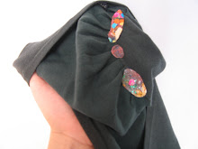
I finally returned the Express shorts to which I had added text. I actually went by the store, but then chickened out a couple of times before I finally did the return. Express is the one store that has previously caught me; the clerk noticed a pocket I had elongated mid-return, while searching for the tag to scan the item back into their system. That was quite a while back, and at a different Express location, but nonetheless, it has made me have a kind of superstitious nervousness about doing Shell Game there. This return went fine, though. I had purposely chosen a particularly stealthy alteration, in order to lessen my panic as much as possible. As I posted previously, I added text to the underside of a pocket. Here's a shot of the shorts turned inside-out, with the pocket pinned up:
And here's a detail shot of the text:
As per a blog-solicited suggestion, I decided to use Lorem Ipsum (the standard place-holder text used by type-setters, printers and graphic designers) for the piece. After completing the first pocket I felt like it might look too much like a purposeful design element - like perhaps Express just decided to spice up the pockets by using a text-y print on part of them - so I also added more Lorem Ipsum to the underside of one of the button-flaps on one of the back pockets. The orange on green looks a little more obviously hand-wrought and out of place than the black on white text.
After all that stalling, the return went quite easily. The clerk didn't even give the shorts the customary cursory once-over before taking them back.
Wednesday, June 30, 2010
Friday, June 25, 2010
Key to the City: Part One?
I'd heard rumors about Paul Ramirez Jonas' Key to the City - excited murmurs from other artists - before I read any of the press about the piece. The idea - public art piece/scavenger hunt/award ceremony hybrid - is a fertile one. Here is how Creative Time, who sponsors the piece, describes it on its website:
"One to one, one at a time, all of the time, thousands of keys will be bestowed by thousands of people on thousands of citizens for thousands of reasons that deserve to be recognized. Keys to cities are traditionally given by a mayor to a hero or dignitary, symbolizing that they can have free entrance to the city. This new Key to the City belongs to us, and is awarded among ourselves. And with this new key, we gain an opportunity to step back and reflect on common space in the city. For not only does the key open up specific sites, but it can also make us aware that the city is a series of spaces that are locked or unlocked."
What this boils down to is that if you go to Times Square with a partner and perform a little ceremony, you can get a key that opens a variety of locks with a variety of results, and a little passport-like booklet showing where to find these locks.
"One to one, one at a time, all of the time, thousands of keys will be bestowed by thousands of people on thousands of citizens for thousands of reasons that deserve to be recognized. Keys to cities are traditionally given by a mayor to a hero or dignitary, symbolizing that they can have free entrance to the city. This new Key to the City belongs to us, and is awarded among ourselves. And with this new key, we gain an opportunity to step back and reflect on common space in the city. For not only does the key open up specific sites, but it can also make us aware that the city is a series of spaces that are locked or unlocked."
What this boils down to is that if you go to Times Square with a partner and perform a little ceremony, you can get a key that opens a variety of locks with a variety of results, and a little passport-like booklet showing where to find these locks.
Key to the City kiosk in Times Square (Photo from ArtObserved)
I went to get my key the week after the piece opened. I didn't have any friends available at the time that I wanted to go, so I decided I would just head to Times Square, and draft a stranger to participate with me if necessary. I didn't end up having to work even that hard. Upon asking a volunteer if she knew of anyone else in need of a partner, she matched me up with a woman who was already partway through the line. Score!
Flora, my recently acquired partner, was very personable, and we passed the forty-five minutes or so that it took to make it through the line by chatting. She ran in-house catering for an advertising agency, and had read about Key to the City in the New York Post. She wasn't a big follower of contemporary art, but had a friend who was, and so had recently been to the Whitney Biennial. We compared notes, and talked of the city in general. It was a nice venue for getting to know a stranger.
When we got to the front of the line we read the ceremony script, exchanged keys, signed the register, and said our goodbyes. So far, the piece was living up to my expectations: it created a reason to go somewhere that I wouldn't normally venture (Times Square), and a new and interesting social situation.
The actual deployment of the key, however, has been less successful. It took a couple of weeks before I made it to the first lock. Many of the locks are located places that involve time constraints. The one at Gracie Mansion is only available on Wednesdays, and I ended up in that part of town on Sunday. I was near the site at Cabinet Magazine on a date it was open, but too late in the day. My time and location finally aligned in DUMBO, where I went to the site in a locker at Gleason's Gym.
When I arrived at the Gym, I told the receptionist that I was there for the Key to the City. She asked if I wanted to look around for the locker, or have her tell me where it was. I looked uncomfortably at the array of large men boxing intently throughout the space, and asked her to just tell me where it was. She pointed me to the opposite corner of the room, and I made my way past boxing bags and rings and people ignoring me. The locker unlocked to reveal boxing gloves and other gym accouterments, along with a box full of a bunch of copies of a small magazine related to the sport. Next to me a few trainers were looking at pictures on a computer and chatting. I pondered what they must think of a person making a pilgrimage to their gym unlock this space. I made a half-hearted gesture of touching a few of the objects in the locker and then left quickly. I was disappointed that the locker contained exactly what one would expect it to contain. The appeal of the locked door is that there could be anything behind it. And anything surprising would be of interest. But my visit to Gleason's did not feel like an award or an adventure, just like being a tourist in a place that is not an attraction.
I'm still optimistic that some of the lock sites that operate differently may be more engaging to me. For example, the key is supposed to allow you to turn on and off a lamp-post in Bryant Park, which sounds fun, and perhaps some of the boxes that are in more artistic locations will have more artistic contents. If I manage to visit any more sites, I'll 'part two' this baby.
Monday, June 21, 2010
Hey Beautiful
I've just about finished my smiling people painting, which I've taken to calling Hey Beautiful. I may go back and do a few touch ups here and there, but for the most part, I feel done with it. Here are some process shots as well as the final one, the lowest on the page being the most recent:
Wednesday, June 9, 2010
Time Lapse: Step-By-Step Painting Construction
I've been meaning to post process shots of a few of my older paintings that I thoroughly documented while in progress, and since this last week has mostly been activity not worth reporting, it seems as good a time as any. I always find it interesting to see how paintings actually develop - the way that color, layering and composition change over time. Here is how I constructed my painting, The Party-goers:
Since my paintings are often inspired by a narative situation or moment, I almost always have all composition and imagery in mind when I start a piece. Colors, textures, and details may vary, but the arrangement of shapes stays the same throughout. Because of this, I basically end up making huge coloring books for myself - a process which is, as far as I can tell, somewhat unusual, and perhaps more constricting than it ought to be, but it is what feels natural to me.
Tuesday, June 1, 2010
Grrrrrr
Jessica's big head is giving me problems. After many hours of work on it this weekend, and several attempts at retouching, I finally went back in and scrubbed it out to start anew. I think that the biggest issue is, well, how big it is. Because Jessica sits a couple feet in front of the other people in my source photos, she is by far the largest figure. But as true as the perspective may be, it looks strange when painted. This is partly because I chose to paint the people on the couch, where most of the sitters are located, approximately life size. Jessica, in the foreground, needs therefore to be larger than life size, and so ends up looking like a stray figure from a mural or billboard instead of a cohesive part of the composition. On my next attempt, I'll have to figure out a better balance between the suggestion of perspective and what fits in with the rest of the painting.
Here are a couple of process shots to give you an idea of how things were going before I got entangled in scale issues. My first layer of color:
And the first few flesh tones applied:
Here are a couple of process shots to give you an idea of how things were going before I got entangled in scale issues. My first layer of color:
And the first few flesh tones applied:
Friday, May 28, 2010
Further Workshopping Some Green Shorts
In my last post I asked for ideas of what sort of text to add to the under-pocket of the Shell Game garment on which I am currently working. I quite liked Jon's suggestion to use Lorem Ipsum (the standard place-holder text used by type-setters, printers and graphic designers), and so have gone ahead and done so. Here's a shot of the shorts turned inside out, with the pocket pinned up to reveal the added text.
Here's a close-up of the Lorem Ipsum:
I painted the text in my approximation of Times New Roman, and as a result I'm concerned that it may look too much like a purposeful design ellement. Since workshopping this piece worked so nicely earlier, I'm going to do so again. What do you think - does it look like the text is just a standard mass-produced design element, or would someone who found it know that it had been altered? If it looks too standard, what would you suggest to make it less so? Some ideas I have considered include adding color to part of or around the text, sewing small beads onto the text to dot some of the 'i's, and adding more Lorem Ipsum to other hidden pocket areas. But I would really appreciate it if you would just be creative for me again.
Here's a close-up of the Lorem Ipsum:
I painted the text in my approximation of Times New Roman, and as a result I'm concerned that it may look too much like a purposeful design ellement. Since workshopping this piece worked so nicely earlier, I'm going to do so again. What do you think - does it look like the text is just a standard mass-produced design element, or would someone who found it know that it had been altered? If it looks too standard, what would you suggest to make it less so? Some ideas I have considered include adding color to part of or around the text, sewing small beads onto the text to dot some of the 'i's, and adding more Lorem Ipsum to other hidden pocket areas. But I would really appreciate it if you would just be creative for me again.
Wednesday, May 26, 2010
Looking for Ideas
I've just purchased a new pair of shorts for Shell Game, which I've decided I want to alter by adding text. I've never added text to a garment before, and am not at all sure what it should say. The shorts are the type that have two overlapping pockets.
This picture shows them turned inside out, with the second (white) pocket pinned up so that you can see the space underneath. I intend to add the text to the underside of that white pocket. Anyone have any good ideas of what it should say?
Thursday, May 20, 2010
A Lap Full of Happy
My most recent clothing work may be the closest that the Shell Game part of my practice has come to the painting part. I purchased this dress from H&M:
And because I've been preoccupied lately with wanting to make images that look lovingly at their audience, I added this group of smilers to the underskirt:
Although populated by different people, this is a very similar set up to the large oil painting that I'm currently working on. In fact, the background from the source photo for this one (which I omitted on the underskirt), is the background that I'm using for the large work. Here's the above painting in context:
As I selected this dress, and then waited in a very long line, I imagined putting figures at the bottom of the underskirt, atop the hemline, but when actually purchasing I realized that that spot was where the electronic theft-prevention thing had been clipped. Assuming the clip would be re-attached after the piece was returned, here was yet another way that my alteration could potentially be found before returning to the racks. So I opted for lap placement instead, which also has a certain suggestiveness to it.
I hope that I placed it high enough to avoid detection. This painting is the most involved figurative intervention that I've done. What do you think - good direction to head in, or should I focus on more structural/sculptural additions?
And because I've been preoccupied lately with wanting to make images that look lovingly at their audience, I added this group of smilers to the underskirt:
Although populated by different people, this is a very similar set up to the large oil painting that I'm currently working on. In fact, the background from the source photo for this one (which I omitted on the underskirt), is the background that I'm using for the large work. Here's the above painting in context:
As I selected this dress, and then waited in a very long line, I imagined putting figures at the bottom of the underskirt, atop the hemline, but when actually purchasing I realized that that spot was where the electronic theft-prevention thing had been clipped. Assuming the clip would be re-attached after the piece was returned, here was yet another way that my alteration could potentially be found before returning to the racks. So I opted for lap placement instead, which also has a certain suggestiveness to it.
I hope that I placed it high enough to avoid detection. This painting is the most involved figurative intervention that I've done. What do you think - good direction to head in, or should I focus on more structural/sculptural additions?
Monday, May 17, 2010
Why Hello There, Gorgeous
I've just finished the under-painting for my next large oil on paper painting. I've generated this composition differently than most. Instead of starting, as I usually do, by thinking of what image I would most want to paint, I began by thinking about what image I would most want to have on my wall. I decided that if I were being honest, the image that I would most want to encounter everyday would be one of a bunch of people looking at me as though they love me and are joyous to see me. So this is the feeling that I'm setting out to evoke with this group of smilers. I want the painting to gaze with love upon it's viewer.
Do you think I can manage to complete a painting that smiles affectionately at it's viewer without its veering too deeply into the creepy?
Friday, May 14, 2010
Maps and Cookies
Wandering the internet, I came upon fakeisthenewreal.org, where artist and urban planner Neil Freeman has posted some lovely and intriguing mapping work. I think my favorites are Streets Centered, Street Gradient, Contextual Calendar, and Symbolic Alphabet, but really, it is difficult to choose.
And, and in line with my love of playful art projects in public space, Jane McGonigal is writing out the myth of sysiphus, in cookies, one word at a time, all over the world.
Labels:
Contemporary Art,
Jane McGonigal,
Links,
Maps,
Neil Freeman,
Public Art
Subscribe to:
Posts (Atom)