Sunday, November 29, 2009
Red Gap Shirt
Finally, I have gotten a new camera! There has been a distinct backlog as far as documenting and posting about my work recently, on account of my previous camera entirely giving up the ghost. But now I am outfitted anew, and can once again produce lovely pictures like these:

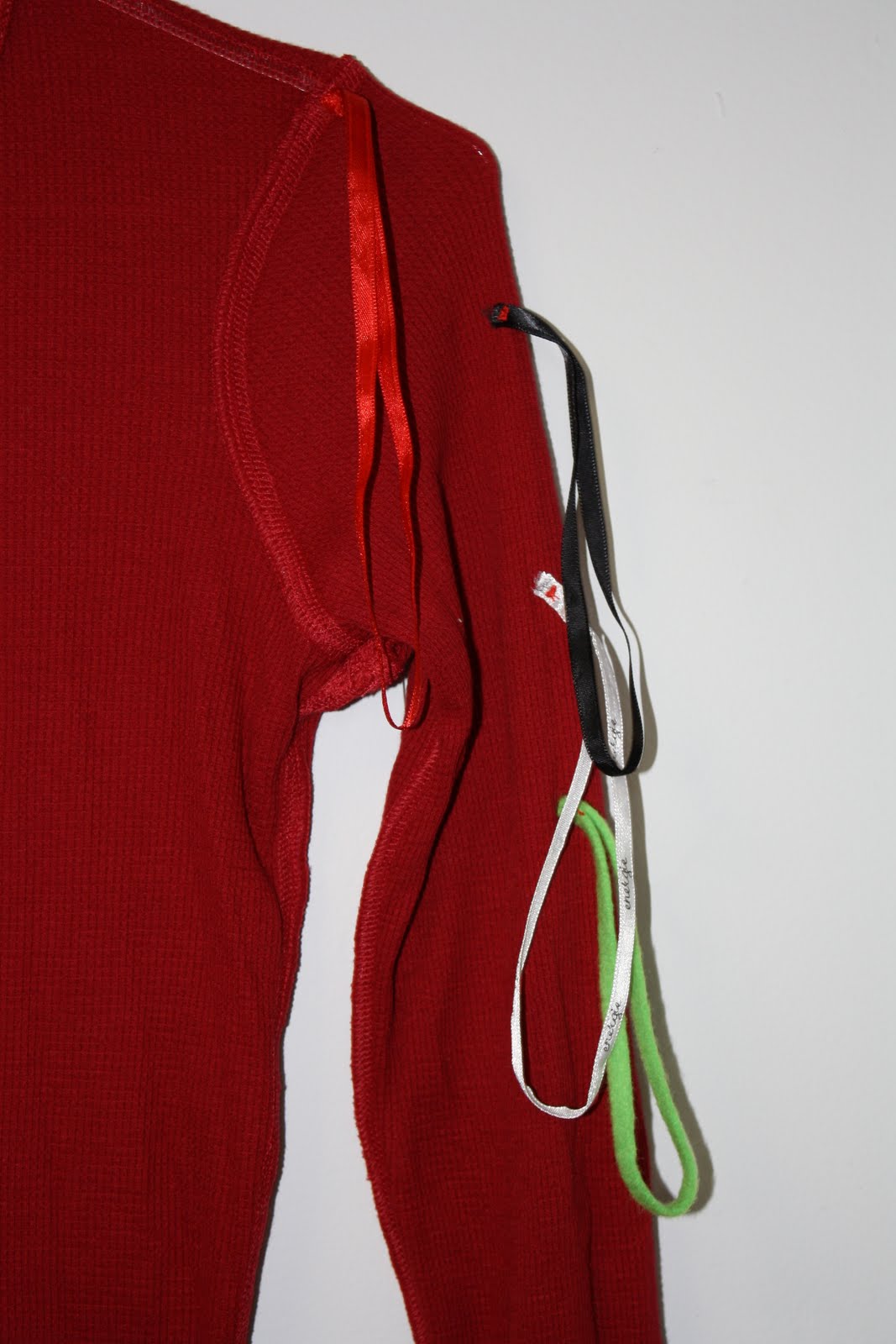
This is a shirt from the Gap, which I've sewn an assortment of ribbon loops. I'm not sure if there is a technical term for these loops. They are the sort that you often see inside shirts and dresses that have a wider neck or are sleeveless, or otherwise require assistance staying on the hanger. I've always found them kind of obnoxious and superfluous, and so thought it might be fun to have them sprouting like weeds from one arm of the shirt.
Three of them are loops that I'd cut out of other shirts, one was constructed of green felt, just to make its appearance all the stranger. The sewing was not entirely disguiseable, as there was no seam where I wanted to add the loops, and so little clumps of red thread create tiny divots that you can see from the outside of the shirt. There is an example at the middle of the picture below.
Camouflaging my stitches has been rendered somewhat moot, though, by the fact that I didn't return the shirt in time. This means it gets added to the collection of clothing that, were I ever to show this piece, I would include for sale as artwork (amid the documentation of successfully returned items, which would make up the bulk of the display).
Tuesday, October 27, 2009
Charles Dickens and An Attempt at To Be Continued

I feel like I need a new graphic for my posts about my sticky-note stories. One image of text on a post-it in front of text looks much like another. I did like how this one was interloping below "Interlopers" though.
I've just returned my latest sticky-note story to the library, pressed between the pages of Bleak House, A sprawling coming-of-age-ish novel by Charles Dickens.
In the spirit of Dickens' novels, which generally appeared in newspapers in serial form, I decided that this story would be a serial one, spanning several library books. At the end of the book I made a "To be continued" sticky-note:
Which means that I'm committed to this story being at least a two-parter, even though I've had a rather difficult time even getting out part 1, which you can find here, should you be interested. Let me know - do you think it deserves much in the way of continuation?
Labels:
Bleak House,
Charles Dickens,
Post-it books,
Serial Story
Saturday, September 26, 2009
Old Navy Jeans
This time they were from Old Navy, but
Sunday, August 30, 2009
Muses Wanted
I'm sort of in the mood to do a crowd scene, but no particular scene is calling to me. I've done a couple of crowd paintings in the past. Both deal with an individual who is in a crowd, but for some reason separate.
There was The Party Goers:

And, the rather uninspiredly titled, Crowd:
So, anyone got any ideas for the next one? (I'm unlikely to ever use them, but you never know what will lead somewhere.)
Monday, August 24, 2009
Post-adolescence Notes: The Eagle & The Nightengales

I completed the post-it note story for Mercedes Lackey's The Eagle and the Nightingales, and returned it to the library. It took me quite a while to write the story for this book, because I wanted the story to in some way address the relationship I had with Mercedes Lackey's books when I was in High School - the heyday of my Lackey reading - and it turns out that I find it very difficult to make high schoolers interesting. At least without making them act like twenty-five year olds.

You can read the complete addition to Mercedes Lackey's novel here and here (it is in two parts for ease of upload).
Sunday, August 23, 2009
At Last!
I've finally finished this painting:

Of which I still can't seem to get a very good picture. (The dark line at the left edge of the photo is just the camera freaking out, and it's a little darker, and well, blurier, than the painting is)
The painting is about 48" x 60", oil on paper. Here are some detail shots, though, which should give you a slightly better idea of what's going on, at least as far as texture and palette goes.


I always find myself very attracted to detail shots of my paintings. So much so that sometimes I want to make a much larger painting just based on the detail shot. But I know that I would end up finding that painting rather boring, as I end up finding many purely abstract paintings boring. It has to be part of the larger whole for me, even if, in the end, it is the details that I find most satisfying.
Of which I still can't seem to get a very good picture. (The dark line at the left edge of the photo is just the camera freaking out, and it's a little darker, and well, blurier, than the painting is)
The painting is about 48" x 60", oil on paper. Here are some detail shots, though, which should give you a slightly better idea of what's going on, at least as far as texture and palette goes.
I always find myself very attracted to detail shots of my paintings. So much so that sometimes I want to make a much larger painting just based on the detail shot. But I know that I would end up finding that painting rather boring, as I end up finding many purely abstract paintings boring. It has to be part of the larger whole for me, even if, in the end, it is the details that I find most satisfying.
Wednesday, August 12, 2009
Staying Inside the Lines

A friend sent me a link to this color-in dress by Berber Soepboer & Michiel Schuurman.

I'm very curious as to how it works... Does the color wash out? Or is it permanent? Unclear, but intriguing.
Berber Soepboer's website also has a lot of other smart and rather beautiful work - some done with Michiel Schuurman, some without. Some of it made me think of new avenues for Shell Game. Some of it just made me want to design clothing myself. All of it is worth a look.
Sunday, July 26, 2009
American Eagle Jeans
One thing I did like at American Eagle, was that although I didn't notice it until I'd taken them home, the cut of jeans that I chose to alter was called "ARTIST". Someone suggested that I should have added a question mark after the word, but unfortunately I'd already returned them.
My Shell Game garments tend to fall into two distinct categories. There are the more representational or graphic ones, like these jeans, or the pants where I added lips, or the tiny acrylic paintings sewn into seams, and there are the more sculptural / structural pieces, like the pants with elongated pockets, or shoulder pads added at the knees, or pockets lined with pink fake fur. I am curious: do you have a preference for one vein over another?
Thursday, July 23, 2009
The Genre Explored
I happened, quite by accident, upon this website the other day:


Which contains a collection of stories illustrated by Arthur Jones with drawings on post-it notes. This piqued my interest for what else is being done in the post-it note genre. A few google searches revealed:
The emphasis for both of the above seems to be on post-its as a way of limiting word count, and perhaps as a way of disrupting the feeling of preciousness that can make writing difficult.
And here's a visual post-its piece at UCSC that uses the sticky squares as pixels:
Here's a really odd office supply website (there is a version of lolcatz done with chairs that I kept finding in various connected pages) that has posted a nice collection of mosaics made out of post-its.
Oh, and wait, here is yet another cool Web Urbanist post that has quite a few nice examples of Mosaic type works:
I have yet to find any pieces displayed or referenced that seem very close to my post-it note books in concept or execution, which makes me happy in that way that I probably should try to rise above or something.
The emphasis for both of the above seems to be on post-its as a way of limiting word count, and perhaps as a way of disrupting the feeling of preciousness that can make writing difficult.
And here's a visual post-its piece at UCSC that uses the sticky squares as pixels:
Here's a really odd office supply website (there is a version of lolcatz done with chairs that I kept finding in various connected pages) that has posted a nice collection of mosaics made out of post-its.
Oh, and wait, here is yet another cool Web Urbanist post that has quite a few nice examples of Mosaic type works:I have yet to find any pieces displayed or referenced that seem very close to my post-it note books in concept or execution, which makes me happy in that way that I probably should try to rise above or something.
Thursday, July 2, 2009
New Post-its for a New Book: The Little Stranger
I've finished my symbiotic story for the new Sarah Waters book. Unlike her previous novels The Little Stranger has no lesbian romance whatsoever. So, in a move that I hope doesn't suffer for being obvious, I've inserted a lesbian love story. Or, to be more precise, a lesbian flirtation story.Since I've been feeling pretty uninspired when it comes to writing (still puzzling out what to add to the Mercedes Lackey book I checked out of the library over a month ago...) instead of creating a new story for the occasion I simply altered the first story that I wrote, for Hateship, Friendship, Courtship, Loveship, Marriage, substituting a girl protagonist for a boy - and of course changing the references to the host book that are part of the story. Changing the gender of a character in an already written story was an interesting exercise. The primary challenge was differentiating between the characters when they were suddenly both "she"s. I also changed both the characters appearances, but left their interactions pretty much the same. I'm curious if the scenario seems strained or not.
Here is the scan of my entire addition to the Sarah Waters novel.
Subscribe to:
Posts (Atom)