Sunday, August 30, 2009

Muses Wanted

Now that I've finished the eavesdropping painting, I've got a blank canvas staring at me, and need to figure out what to paint next.

I'm sort of in the mood to do a crowd scene, but no particular scene is calling to me. I've done a couple of crowd paintings in the past. Both deal with an individual who is in a crowd, but for some reason separate.

There was The Party Goers:


And, the rather uninspiredly titled, Crowd:

So, anyone got any ideas for the next one? (I'm unlikely to ever use them, but you never know what will lead somewhere.)

Monday, August 24, 2009

Post-adolescence Notes: The Eagle & The Nightengales


I completed the post-it note story for Mercedes Lackey's The Eagle and the Nightingales, and returned it to the library. It took me quite a while to write the story for this book, because I wanted the story to in some way address the relationship I had with Mercedes Lackey's books when I was in High School - the heyday of my Lackey reading - and it turns out that I find it very difficult to make high schoolers interesting. At least without making them act like twenty-five year olds.


You can read the complete addition to Mercedes Lackey's novel here  and here (it is in two parts for ease of upload).

Sunday, August 23, 2009

At Last!

I've finally finished this painting:


Of which I still can't seem to get a very good picture. (The dark line at the left edge of the photo is just the camera freaking out, and it's a little darker, and well, blurier, than the painting is)

The painting is about 48" x 60", oil on paper. Here are some detail shots, though, which should give you a slightly better idea of what's going on, at least as far as texture and palette goes.


I always find myself very attracted to detail shots of my paintings. So much so that sometimes I want to make a much larger painting just based on the detail shot. But I know that I would end up finding that painting rather boring, as I end up finding many purely abstract paintings boring. It has to be part of the larger whole for me, even if, in the end, it is the details that I find most satisfying.

Wednesday, August 12, 2009

Staying Inside the Lines


A friend sent me a link to this color-in dress by Berber Soepboer & Michiel Schuurman.


I'm very curious as to how it works... Does the color wash out? Or is it permanent? Unclear, but intriguing.

Berber Soepboer's website also has a lot of other smart and rather beautiful work - some done with Michiel Schuurman, some without. Some of it made me think of new avenues for Shell Game. Some of it just made me want to design clothing myself. All of it is worth a look.

Sunday, July 26, 2009

American Eagle Jeans

I need to remember not to do Shell Game with American Eagle anymore. They require ID when you return something. As an attempt at subterfuge, I gave them my old college ID, which doesn't list any address, and then when they asked for my address, I changed one of the numbers when dictating it. Not a terribly smooth deception.

One thing I did like at American Eagle, was that although I didn't notice it until I'd taken them home, the cut of jeans that I chose to alter was called "ARTIST". Someone suggested that I should have added a question mark after the word, but unfortunately I'd already returned them.

Perhaps the ARTIST jeans got me in a literal mood. I made a flock of bird silhouettes cut out of denim, which I then sewed into the inside of the pant legs. This proved to be some of my most challenging seamstressing yet - instead of sewing into a lining or a seam, I was sewing directly into a single layer of fabric.

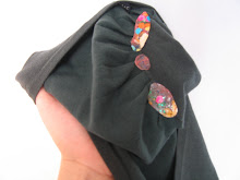
I used a dark color of thread and very small stitches, and without knowing what you were looking for, it was very difficult to perceive my work from the outside. To the right is a picture of the pant leg turned right side out after my alterations, and perhaps if you look carefully you can see a couple of greenish dots (one toward the bottom left of the photo is most apparent) which are my stitches.

Here's a picture with the legs inside out, of the denim birds close up. After sewing them into the jeans I felt like the denim on denim look was a little more subtle than I wanted, so I went back and painted some shadows and highlights on them with acrylic, to give them that ARTIST touch.

Here is a full view of the completed pants turned inside out. The flock seems to be moving from one leg to another - and here's what I mean when I say I was feeling literal - as I made them I imagined them to be a flock of smaller birds, hiding from the eponymous Eagle.

My Shell Game garments tend to fall into two distinct categories. There are the more representational or graphic ones, like these jeans, or the pants where I added lips, or the tiny acrylic paintings sewn into seams, and there are the more sculptural / structural pieces, like the pants with elongated pockets, or shoulder pads added at the knees, or pockets lined with pink fake fur. I am curious: do you have a preference for one vein over another?

Thursday, July 23, 2009

The Genre Explored

I happened, quite by accident, upon this website the other day:


Which contains a collection of stories illustrated by Arthur Jones with drawings on post-it notes. This piqued my interest for what else is being done in the post-it note genre. A few google searches revealed:


The emphasis for both of the above seems to be on post-its as a way of limiting word count, and perhaps as a way of disrupting the feeling of preciousness that can make writing difficult.

And here's a visual post-its piece at UCSC that uses the sticky squares as pixels:


Here's a really odd office supply website (there is a version of lolcatz done with chairs that I kept finding in various connected pages) that has posted a nice collection of mosaics made out of post-its.


Oh, and wait, here is yet another cool Web Urbanist post that has quite a few nice examples of Mosaic type works:


I have yet to find any pieces displayed or referenced that seem very close to my post-it note books in concept or execution, which makes me happy in that way that I probably should try to rise above or something.

Thursday, July 2, 2009

New Post-its for a New Book: The Little Stranger

I've finished my symbiotic story for the new Sarah Waters book. Unlike her previous novels The Little Stranger has no lesbian romance whatsoever. So, in a move that I hope doesn't suffer for being obvious, I've inserted a lesbian love story. Or, to be more precise, a lesbian flirtation story.

Since I've been feeling pretty uninspired when it comes to writing (still puzzling out what to add to the Mercedes Lackey book I checked out of the library over a month ago...) instead of creating a new story for the occasion I simply altered the first story that I wrote, for Hateship, Friendship, Courtship, Loveship, Marriage, substituting a girl protagonist for a boy - and of course changing the references to the host book that are part of the story. Changing the gender of a character in an already written story was an interesting exercise. The primary challenge was differentiating between the characters when they were suddenly both "she"s. I also changed both the characters appearances, but left their interactions pretty much the same. I'm curious if the scenario seems strained or not.

Here is the scan of my entire addition to the Sarah Waters novel.

Thursday, June 25, 2009

So As Not To Entirely Loose The Habit

I'm in the midst of drawing up the post-it notes for a Sarah Waters library book, have somewhat stalled in my endeavors to write the text for a story to add to a really unimpressive Mercedes Lackey novel, have a pair of American Eagle jeans waiting for additions inspiration to percolate, and haven't touched a palette knife in weeks. Since none of this is very post-worthy, I'm going to stray from my own work to offer up a few links.

Here is the work of Rebecca Campbell - probably my favorite contemporary painter.

Campbell grapples with beauty and transcendence, without straying into the cheesy or maudlin.

And here is an article from the New York Times that I read today - the renegade cabaret it describes seems nicely in the spirit of some of the guerrilla art I've linked to before.

Thursday, June 11, 2009

Gap Dress Return

Today was the first good chance I'd had to return the black Gap sundress since I altered it, and so was dismayed to realize that I was one day past the receipt announced thirty day limit on returns. Of course, I know that Gap often has very lenient and forgiving return policies, and it seemed unlikely that the clerk would even check the date, much less do the math, but still, any hitch in the returning process revs my nerves into high gear. So I summoned all my artistic fortitude, gathered my courage... and got a coworker to return the dress for me. She wasn't nearly the stickler that I was for return dates, and had no trouble at all.

Even if the dress had been unreturnable, it would not necessarily have been a loss. I've made two other pieces that I haven't gotten a chance to return before the deadlines were quite past, and so I kept them. One is a dress from H&M where I painted geometric patterns on the underskirt:


The other is a pair of pants with an elongated pocket, also from H&M (the preponderance of unreturned H&M sprouts from a thirty day return policy plus stores that are inconvenient to my usual schedule).


I imagine that if I were to show Shell Game in a gallery setting, aside from the photographic documentation, one component of the display would be a rack with a collection of clothing that I altered, but either didn't get a chance to return, or was for some other reason unreturnable. The clothing on this rack would have art prices on their tags; hundreds or thousand dollar prices, instead of the twenty to eighty bucks that my altered pieces go for at the Gap, H&M, etc... in the instances that they are presumably successfully resold.

Thursday, June 4, 2009

Gap Black Sundress

In case you were racked with suspense, returning the shorts with the lip paintings went just fine. I now have a new piece ready for return: a black sundress from Gap.

I chose the sundress because although it had a nice substantial underskirt, the top layer was not at all diaphanous, making the space between the two layers relatively secure for my purposes. I sewed a zipper to the top side of the underskirt with a little fold of fabric in between gripping sides, to which I then added a strip of bright white lace. Here's a shot with the skirt hiked up so that you can see the underskirt, and the added zipper, in its zipped state:


Here are some shots of the zipper opening, peep-show style:


And another shot, to give you a sense of overall placement and scale:


Visually, the addition is nearly imperceptible, since nothing shows on the outside, unless you pull up the skirt (and even then it is black zipper on black fabric), and when turned entirely inside out, you would only see the black stitching used to hold on the zipper and lace, which is again highly unnoticeable against the black fabric. I am, though, less certain about how obvious the addition is in tactile terms. Thankfully, the fabric is rather stiff, so it is less likely that odd bunching, or a little more weight on one side than the other would give me away.