Friday, May 28, 2010

Further Workshopping Some Green Shorts

In my last post I asked for ideas of what sort of text to add to the under-pocket of the Shell Game garment on which I am currently working.  I quite liked Jon's suggestion to use Lorem Ipsum (the standard place-holder text used by type-setters, printers and graphic designers), and so have gone ahead and done so.  Here's a shot of the shorts turned inside out, with the pocket pinned up to reveal the added text.
Here's a close-up of the Lorem Ipsum:
I painted the text in my approximation of Times New Roman, and as a result I'm concerned that it may look too much like a purposeful design ellement.  Since workshopping this piece worked so nicely earlier, I'm going to do so again.  What do you think - does it look like the text is just a standard mass-produced design element, or would someone who found it know that it had been altered?  If it looks too standard, what would you suggest to make it less so?  Some ideas I have considered include adding color to part of or around the text, sewing small beads onto the text to dot some of the 'i's, and adding more Lorem Ipsum to other hidden pocket areas.  But I would really appreciate it if you would just be creative for me again.

Wednesday, May 26, 2010

Looking for Ideas

I've just purchased a new pair of shorts for Shell Game, which I've decided I want to alter by adding text.  I've never added text to a garment before, and am not at all sure what it should say.  The shorts are the type that have two overlapping pockets. 
This picture shows them turned inside out, with the second (white) pocket pinned up so that you can see the space underneath.  I intend to add the text to the underside of that white pocket.  Anyone have any good ideas of what it should say?

Thursday, May 20, 2010

A Lap Full of Happy

My most recent clothing work may be the closest that the Shell Game part of my practice has come to the painting part.  I purchased this dress from H&M:
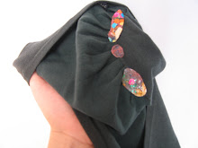
And because I've been preoccupied lately with wanting to make images that look lovingly at their audience, I added this group of smilers to the underskirt:
Although populated by different people, this is a very similar set up to the large oil painting that I'm currently working on.  In fact, the background from the source photo for this one (which I omitted on the underskirt), is the background that I'm using for the large work.  Here's the above painting in context:
As I selected this dress, and then waited in a very long line, I imagined putting figures at the bottom of the underskirt, atop the hemline, but when actually purchasing I realized that that spot was where the electronic theft-prevention thing had been clipped.  Assuming the clip would be re-attached after the piece was returned, here was yet another way that my alteration could potentially be found before returning to the racks.  So I opted for lap placement instead, which also has a certain suggestiveness to it.

I hope that I placed it high enough to avoid detection.  This painting is the most involved figurative intervention that I've done.  What do you think - good direction to head in, or should I focus on more structural/sculptural additions?

Monday, May 17, 2010

Why Hello There, Gorgeous

I've just finished the under-painting for my next large oil on paper painting.  I've generated this composition differently than most.  Instead of starting, as I usually do, by thinking of what image I would most want to paint, I began by thinking about what image I would most want to have on my wall.  I decided that if I were being honest, the image that I would most want to encounter everyday would be one of a bunch of people looking at me as though they love me and are joyous to see me.  So this is the feeling that I'm setting out to evoke with this group of smilers.  I want the painting to gaze with love upon it's viewer.


Do you think I can manage to complete a painting that smiles affectionately at it's viewer without its veering too deeply into the creepy?

Friday, May 14, 2010

Maps and Cookies

Wandering the internet, I came upon fakeisthenewreal.org, where artist and urban planner Neil Freeman has posted some lovely and intriguing mapping work.  I think my favorites are Streets Centered, Street Gradient, Contextual Calendar, and Symbolic Alphabet, but really, it is difficult to choose.

And, and in line with my love of playful art projects in public space, Jane McGonigal is writing out the myth of sysiphus, in cookies, one word at a time, all over the world.

Wednesday, May 12, 2010

Serial in a Sequel: Chip Kidd Post-its

I'm about to return the fourth installment of my serial post-it note story to the library, nestled inside of Chip Kidd's The Learners.


I chose The Learners based simply on wanting to read it, but the fact that it features a recent college graduate dovetails nicely with the situation of my Maddie.  The novel is a sequel to Kidd's first book The Cheese Monkeys, which means that both his story and mine start off in the midst of the tale.


You can read a pdf of my post-it note additions to Chip Kidd's The Learners here.

Thursday, May 6, 2010

Grocery Store Gardening

I'd been meaning, for quite some time, to participate in Planting Seeds, a shopdropping project of bay area artist Hang Nguyen.  Nguyen makes whimsical mock-fruit-stickers, and sends them out upon request for others to leave on grocery store produce world-wide.


I received my stickers in the mail a little while back, and finally took them out for a jaunt while shopping at Fairway, in Brooklyn:

The produce section was pretty congested so I did not manage to use up all my stickers, but I made a dent:

Too literal?  I may not have been considering placement all that carefully.  It was fun, though, to participate in someone else's art project, and nice to do some shopdropping that did not make me as nervous as returning my altered clothing does...

Saturday, May 1, 2010

Old Navy Skirt

My latest return is a skirt from Old Navy:


I added a zipper to the underskirt:


Which unzips to reveal a little tuft of aberrant decoration: a crease of tulle, sequins and crystal:


Those views show the garment with the outer layer flipped up to reveal the underskirt.  Here's the garment turned inside out, from which vantage the alteration is visible, but not terribly noticeable:

I was feeling nervous about this one, so I cashed in a favor to have someone else return it for me, but all went quite smoothly.